Role
Senior Designer
Agency
AKQA
Client
Rolls-Royce Motorcars
Role
Senior Designer
Agency
AKQA
Client
Rolls-Royce Motorcars
After two years of partnership, Rolls-Royce asked AKQA to rethink their product page experience, as part of a redesign process of the whole platform.
AKQA acquired the account in 2015, creating an elegant, touch-responsive gateway that illustrates the luxury lifestyle that the double-R emblem has come to represent. Subsequently, the AKQA team was asked to conceive a second release of the .com platform to redesign the whole digital experience and improve performance.
Working closely with the RR Team over five months to redesign the entire platform, my role was to conceive and craft the experience of the product pages. This included working on the visual design, information architecture, user experience, rapid prototyping, motion design and direction, and delivery of the final product.
The first release of the product page was distinguished by a grid structure, with a visual design pattern consisting of long text and imagery.
With CTAs positioned at the end of every chapter of the page, the previous experience was a bit obsolete, flat and it wasn't performing well enough.
The first release of the product page was distinguished by a grid structure, with a visual design pattern consisting of long text and imagery.
With CTAs positioned at the end of every chapter of the page, the previous experience was a bit obsolete, flat and it wasn't performing well enough.
The first release of the product page was distinguished by a grid structure, with a visual design pattern consisting of long text and imagery.
With CTAs positioned at the end of every chapter of the page, the previous experience was a bit obsolete, flat and it wasn't performing well enough.
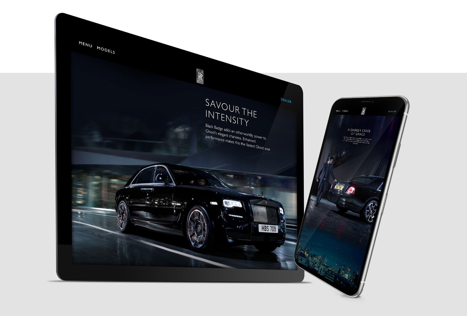
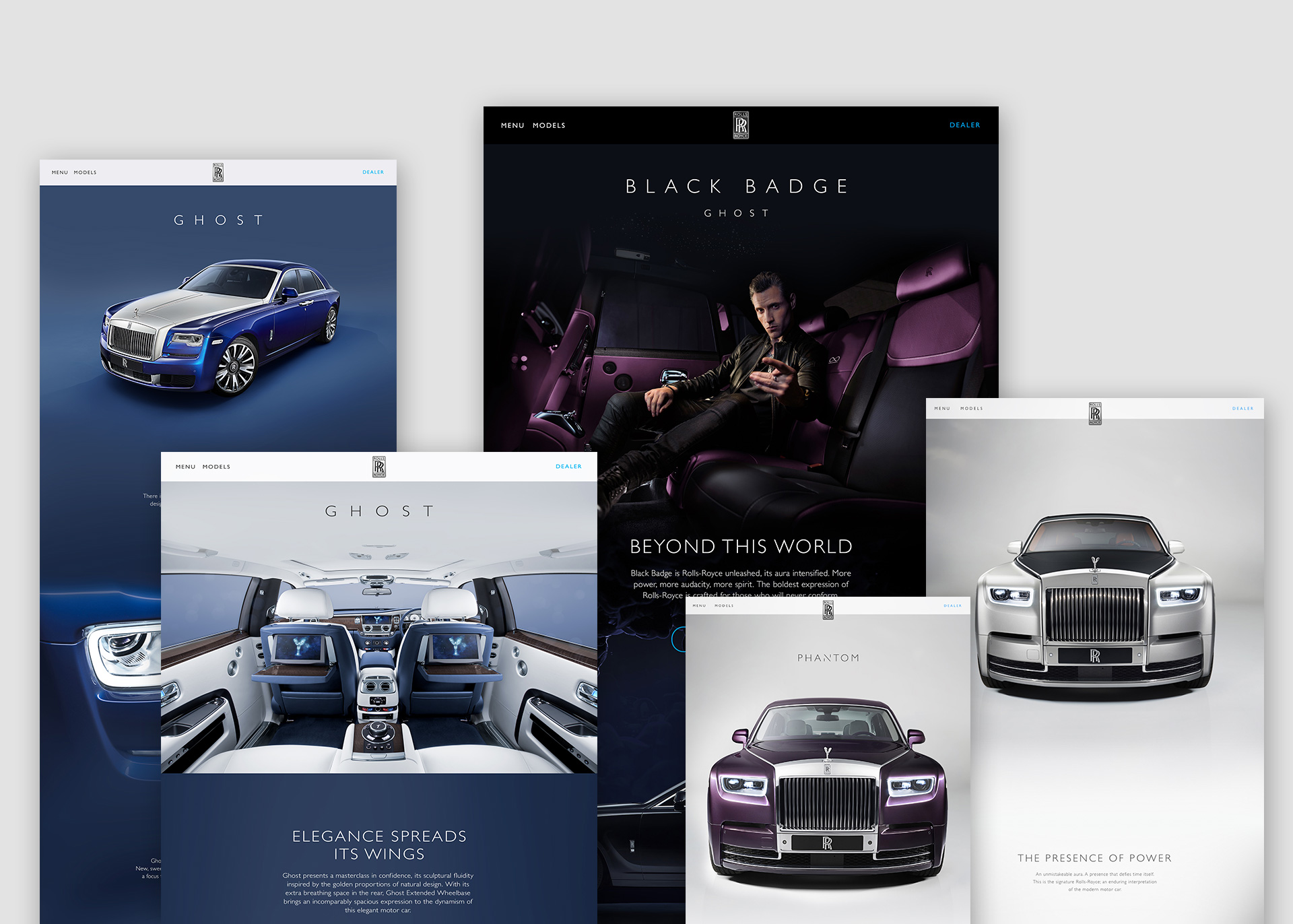
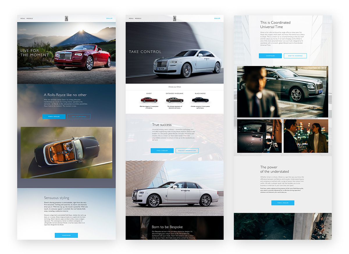
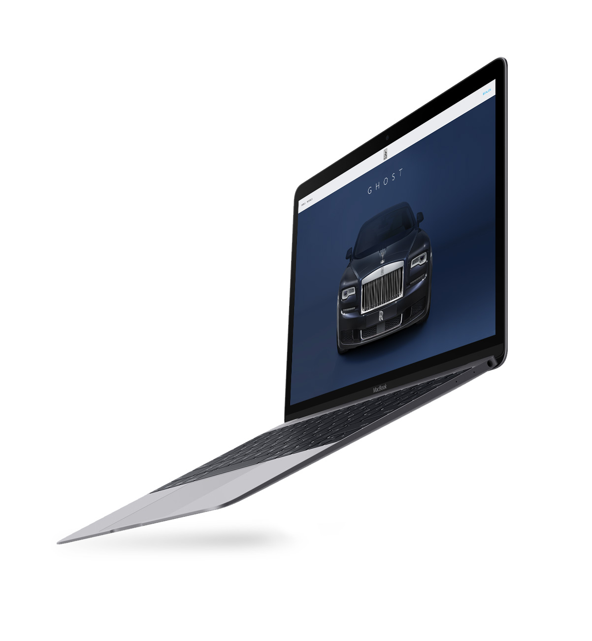
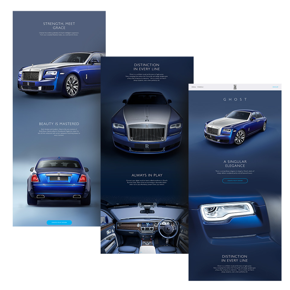
We redesigned the product pages knowing that Rolls-Royce customers wanted to explore the cars more in detail. We decided to get rid of the grid structure to create a new, smooth and sleek experience. The idea was to create a customised narrative depending of the model of the car.
We redesigned the product pages knowing that Rolls-Royce customers wanted to explore the cars more in detail. We decided to get rid of the grid structure to create a new, smooth and sleek experience. The idea was to create a customised narrative depending of the model of the car.
We redesigned the product pages knowing that Rolls-Royce customers wanted to explore the cars more in detail. We decided to get rid of the grid structure to create a new, smooth and sleek experience. The idea was to create a customised narrative depending of the model of the car.
Design approach.
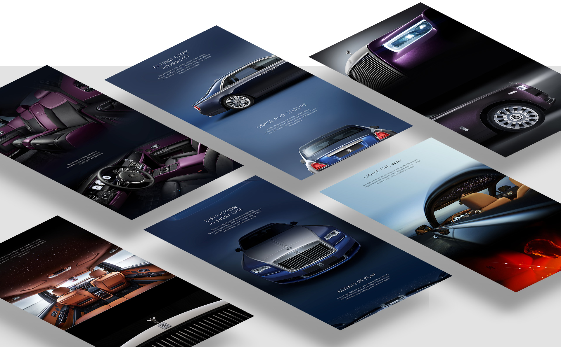
One of the main focuses was to let the amazing beauty of the cars speak for itself, so we decided from the first moment to use the whole screen as a canvas and design a more immersive experience with full bleed images and big headers.
We also wanted to give a homogeneous look and a unique identity to every family model, so we decided to apply a smooth gradient, a simple color palette and a blended single background for each page.
Instead of having long chapters describing the cars, we wanted to offer a clean and smooth experience of discovery through magnified photographs. To pursue this, we kept the body copy sharp and concise, and we got rid of all the CTAs except one at the top and one at the bottom of the page.
Instead of having long chapters describing the cars, we wanted to offer a clean and smooth experience of discovery through magnified photographs. To pursue this, we kept the body copy sharp and concise, and we got rid of all the CTAs except one at the top and one at the bottom of the page.
Instead of having long chapters describing the cars, we wanted to offer a clean and smooth experience of discovery through magnified photographs. To pursue this, we kept the body copy sharp and concise, and we got rid of all the CTAs except one at the top and one at the bottom of the page.
A new design pipeline.
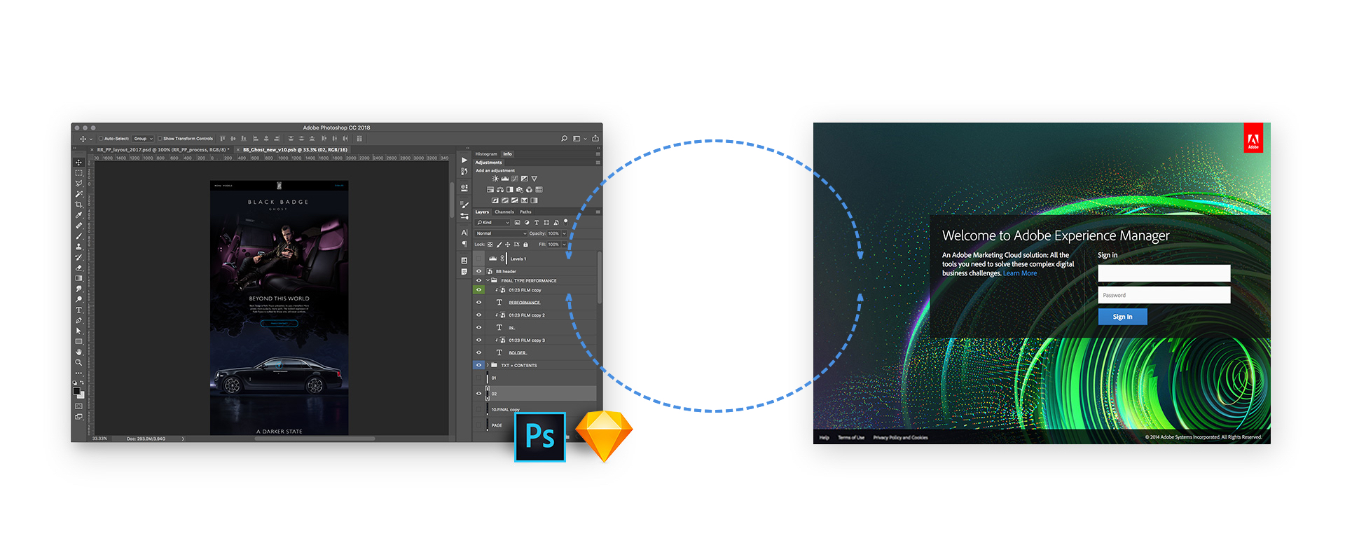
One of the restrictions we had to deal with was a limited development budget. We had to conceive the new design using the current CMS and its limitations. I personally studied a completely new approach for the team by building a new pipeline that would combine the authoring environment with the design process. My idea was to use the authoring environment and its components as a tool for the designers.
A new design pipeline
One of the restrictions we've had to deal with was a limited development budget. We've had to conceive the new design using the current CMS and its limits. I've personally studied a completely new approach for the team, by building a new pipeline that would involve the authoring environment as part of the design process. My idea was to use the authoring environment and his components as a tool for the designers.
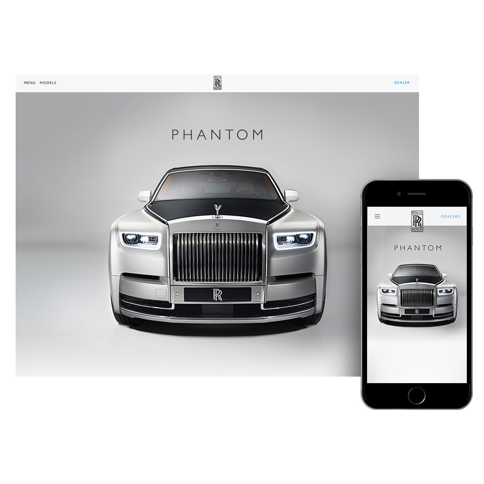
Results.
The new site experienced a 41% increase in traffic. Over 50% of visitors who saw the new product pages spent on average over 3 minutes and scrolled to view the entire page, suggesting they consumed content instead of simply scanning (ref: Phantom pages).
Results.
The new site experienced a 41% increase in traffic. Over 50% of visitors who saw the new product pages spent on average over 3 minutes and scrolled to view the entire page, suggesting they consumed content instead of simply scanning
(ref: Phantom pages).
Results.
The new site experienced a 41% increase in traffic. Over 50% of visitors who saw the new product pages spent on average over 3 minutes and scrolled to view the entire page, suggesting they consumed content instead of simply scanning (ref: Phantom pages).
Results
The new site experienced a 41% increase in traffic. Over 50% of visitors who saw the new product pages spent on average over 3 minutes and scrolled to view the entire page, suggesting they consumed content instead of simply scanning (ref: Phantom pages).
65%
Visitors who reached
the bottom of the page.
65%
Visitors who reached
the bottom of the page.
3
Minutes spent on average
on the page.
3
Minutes spent on average
on the page.
3
Creatives involved:
an ACD, a Copywriter
and Myself.
3
Creatives involved:
an ACD, a Copywriter
and Myself.